
OVERVIEW
PubMatic had an established design system that was being used in the Ad-tech SaaS products, however, the company has identified a lot of inconsistencies in the product usage.
The goal of this project was to identify the gaps in the design system, build a revamping plan and work with different teams to coordinate and create consistency across product lines.
ROLE
Product Designer (Sept 2020 - Oct 2021)
DURATION
8 months
Background
PubMatic is a company that develops and implements online advertising software and strategies for the digital publishing and advertising industry.
I joined PubMatic as a product designer a year ago as one of 4 designers in a company of over 120 engineers and 10 product managers. I support design across every aspect of our business and am responsible for leading UX and UI across key parts of the application side of the platform.
I've grown tremendously in the last year, some key achievements of which I have listed below:
Implemented a design process. This has helped our team establish more structure in how we conduct our work and allow other teams to gain visibility across our upcoming sprints.
Improved usability across the platform. No usability tests were conducted before the dev handoff. Since we established a design team, we have been actively working towards conducting UX research and usability testing on all projects.
Establishing a design kit. This has helped to maintain consistency in the look and feel across different parts of the platform.
Establishing a design system. This has helped the Engineering and Product teams to understand how and why we choose to implement certain components over others.
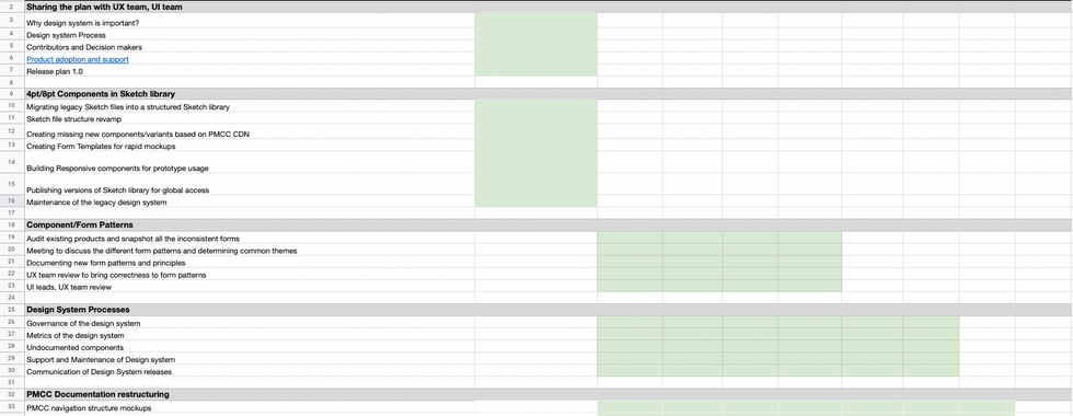
Process
Our process at PubMatic is based on the Double Diamond Theory and Lean UX process. We aim to incorporate the key phases of Discovery, Definition, Ideation, and Implementation in all of our projects.

Understanding the problem
Before PubMatic hired me as a product designer, a beta release of the design system was released. These mockups were created without any usability testing and had little consideration for the technical and product limitations on the scope of work.
I conducted research interviews with our primary users (developers, and designers) to uncover any pain points that they were experiencing with the beta release. My research encompassed:
Understanding the user goals and needs
Uncovering pain points with the existing user journey
Determining the success of the tasks measured
STEP 1: AUDIT PRODUCTS
In order to understand the magnitude of the gaps, I started working on documenting different inconsistencies across products in terms of UX, UI, and new components that weren't documented. Per product, I created a list of observations and connected them with heuristic principles.


I relied on a data-driven approach known as the severity framework to inform my process and list usability issues in order of priority. The framework helps to identify the severity score of a usability issue based on the following three variables:
Task criticality x impact x frequency = severity
Task criticality - how important is the task to the user? (1 = low, 5 = critical)
Impact - how much of an impact does this issue have on the user's task? (1 = suggestion, 5 = blocker)
Frequency (%) - how many times does this come up out of total participants?
STEP 2: USER INTERVIEWS
I interviewed different teams who closely work with design systems and UI libraries. I created user interview questions that would cover how the team utilized mockups for building components, and product pages, and understanding the component library.
What are the key challenges that you have seen while you develop components or product pages?
What is the current limitation that you have seen in the UI library?
What is the key information that you look at when a mockup has been shared?
What are the design problems with the components?
Was there a better way of designing this component? Has anything else come up that is more suited to the use case?
What is the biggest challenge while building wireframes into screens?
Following were the responses from different team members:


STEP 3: DOCUMENTING COMPONENT VARIANTS AND PATTERNS
Across products, I checked all the product pages and components utilized and documented all the different variant and form patterns used inconsistently.
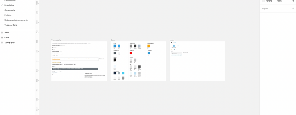
To better understand the current state of our existing design ecosystem, we started with a UI Inventory of our main interface components. The plan was to screenshot unique instances of our main design assets such as typography, buttons, icons, input forms, dropdowns, etc., and add them to the centralized Figma UI inventory repository.
As a result of this exercise, we identified a lot of inconsistencies in our design assets, which only proved the need for a more systematic approach to documenting, communicating, and maintaining our design system.


The inventory process helped us clearly see all discrepancies and inconsistencies across our site and product. It served as a foundation for our design system work. With the audit results in mind, we created a priority list for our design system's minimal viable product (MVP), and started assigning designers that would lead the exploration and documentation of each component.
As you can see, we had many different colors, font sizes, and spacing values. And that was only part of the problem.
By creating an updated centralized design system, we aimed to:
Align our teams by giving them a more structured and guided way to build products.
Speed up our design and development process: with a ready-made library and patterns, teams can create and test layouts much faster.
Improve brand perception and user trust through consistent experiences that work for everyone and allow users to accomplish their goals.
Promote accessibility of our products by building accessibility and inclusion into our component libraries, both from a design and code repository perspective.
While it was clear that this project would require a lot of resources, planning, and time commitments, we knew that this work was a justified long-term investment in our company, brand standards, and our customers.
STEP 4: BUY-IN
In order to ensure the success of this project, it was important to get stakeholders on board before we start building our design system.
By getting other teams involved from the onset and as the project evolved, we strived to promote understanding of the project and inspire a sense of co-ownership throughout the entire process.


We systematically promoted the initiative via:
A kick-off company-wide presentation where I shared the current pain points and the anticipated benefits of the project for the company as a whole.
Involving engineering into the conversation early on through bi-weekly design system meetings and workshops to collect their input.
Sharing with squads work in progress and the roadmap of the project.


Design Exploration
We decided to focus first on the foundational elements (atoms) of our design system, such as color palettes, fonts, grids, spacing, buttons, etc., and then move on to more complex blocks and pieces (molecules, organisms, templates, pages). We created components from scratch since we switched from Sketch to Figma as it served our design needs better.
Some of the activities at this stage involved:
Researching other design systems and interfaces for components common practices and inspiration.
Analyzing the instances and use cases captured during the audit and ideating the solutions that serve our goals best.
Unifying: we merged different variations of components to leave only the essentials. For example, we limited our color schemes to a maximum of 6 shades for some of the hues and all the excessive variations were matched and merged with the decided-upon schemes based on proximity. Below is our final color palette:

Some of the other revamp included:


Documentation
High-quality component documentation is crucial to an effective library allowing everyone to quickly and efficiently make consistent decisions. We wanted to create detailed documentation that would support every single aspect of our design system, and also be organised, consistent, and easy to use. We referred to several design systems such as IBM’s Carbon, Material, Atlassian, Salesforce Lightning, and other design systems for some good practices, guidelines, and tools that we could apply in our design system.


Design-led Documentation
Figma Component Library
Once the Figma components are approved, we move them to a Figma Atomic Components file, a shared library of assets that our team can use to drag and drop while working on their designs.
In-house Documentation Site
We used an in-house UI website, a collaboration platform that integrates with Figma and allows product teams to create and maintain web-based design system documentation. If Figma atomic library is a library of design components, PMCC is a collection of guidelines and rules for those components. At a high level, most of our component documentation in PMCC usually includes:
Introduction with component description
Component construction
Component states
Behaviour
Best practices
Accessibility guidelines
Examples of components in different contexts to demonstrate how design patterns would be applied in real products and specific use cases


Result
Within the organisation, utilisation of the system increased design and development collaboration. It also served to improve efficiency in developing new tools, leading to a more cohesive, higher-quality user experience.
Externally, PubMatic presented a unified, single USAC to stakeholders and succeeded in simplifying the most high-profile systems with the potential to touch millions of users. It created a foundation for building accessible and usable products.
Some key takeaways from this project are:
Create a strategic plan to scale. This helps deal with out-of-scope requests that could potentially derail the project and help deliver a quality product in time.
User testing doesn't end after development. Design is a constant iteration of improving the experience for the end-user. Always find ways to collect and listen to your user's feedback.
Involve engineering upfront. This helps to reduce any rework later on as an understanding of the technical limitations upfront will help to inform your design strategy.


